To facilitate our ad network advertising, we have to provide the content for three digital display ads (banners). You will be required to write the content for a “four frame” banner in multiple sizes. You will be required to develop a visual storyboard for each banner. Please separate each banner on its own page with the following: (15 marks)
1. 300 X 600 Display Ad
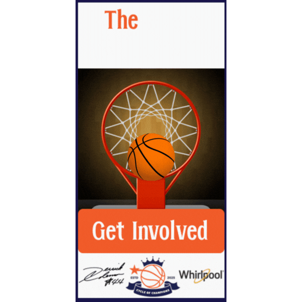
The goal of this display ad is to raise awareness for The Cycle of Champions campaign and encourage viewers to take action. The animation of the gif reveals the phrase “The Cycle Never Stops” one word at a time, which is a play on words for the cycle of a washing machine (hinting at our partnership with Whirlpool) and cycles of basketball drills.
From a design standpoint, this ad uses the campaign’s official color palette to ensure visual consistency with our other campaign materials. The basketball spinning around the rim of the net offers a visual hook that ties directly into the central sport of the campaign and offers a playful tone to the messaging. The “get involved” CTA alters between gray and white, which draws the eyes of a passerby to it subconsciously. Finally, at the bottom of the ad lies our campaign’s logo, Derrick Coleman’s signature (to signify his involvement in the campaign) and the Whirlpool logo, letting readers immediately know the main players involved in the campaign before even needing to investigate.
The planning process focused on appealing to both of our core audiences. The energetic, sequential reveal of text feels modern and accessible to young viewers, while the structured layout and prominent CTA also speak to adults, which encourages supporting friends, family members and members of the community to get involved.
2. 160 X 600 Display Ad
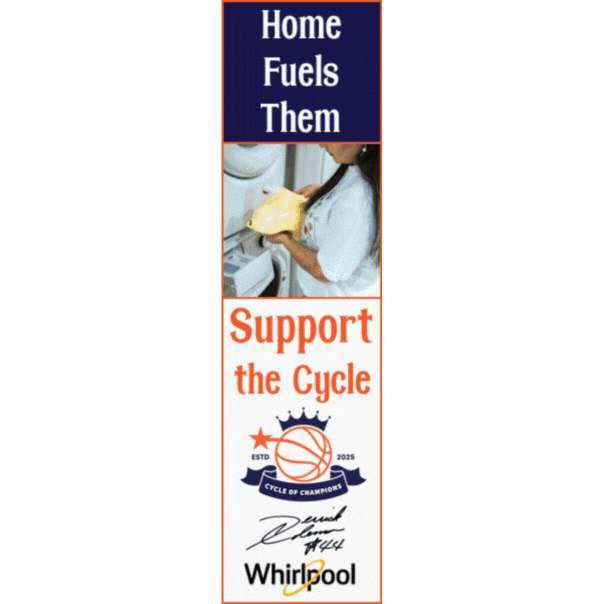
The primary goal of our skyscraper-style display ad is to display how everyday support systems at home, school, and during extracurricular activities are integrated into the lives of young athletes/students. These support systems empower young athletes and also happen to make up the audience B of our campaign.
The vertical format of the ad allows us to use storytelling as the cornerstone for our messaging. It starts with the phrase “Home Fuels Them” above an image of a mother doing laundry, which is often an underappreciated yet foundational role in the lives of young athletes. This frame also ties directly into the campaign’s collaboration with Whirlpool, allowing viewers to correlate the role of doing laundry with the athletic and academic success of young students. Then, viewers are introduced to other influential environments and members of a young student’s life, building a picture of the full support network behind youth athletes. The phrase “Support the Cycle” brings the message full circle and reinforces the broader theme of ongoing, community-driven development.
This ad was made to resonate with community members, parents, educators, and mentors, the adults who are part of the ecosystem that nurtures Detroit’s youth. By showcasing the less visible acts of care and linking them to the success of youth, the ad calls on adults to see themselves as part of the cycle and invites them to keep that cycle turning by getting involved or offering support.
3. 468 X 60 Display Ad
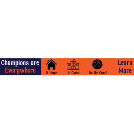
Our horizontal banner ad is designed to catch quick attention and reinforce the campaign’s core message in a visually simplified and digestible format. Its goal is to show that youth champions exist in every part of life and to prompt users to click or explore further to learn about our “Cycle of Champions” campaign.
To work with the limited space available to us in this ad format, branding is less present here than in the other two display ad formats. This allowed us to focus over graphical clarity and simplicity over adding busy branding elements in the display ad. The icons used to represent each of the environments keeps the display ad clear and accessible, especially for viewers on mobile or fast-scrolling environments.
This banner is optimized for horizontal placement across websites where branding must take a backseat to brevity and clarity. It targets a general community audience, targeting both our audience A (youth) and audience B (families, educators, supporters, etc…), which quickly communicates that everyone has a role in the cycle of support.
By ending on our “Learn More” CTA, the ad encourages engagement without being heavy-handed, inviting viewers to connect deeper with the campaign through a landing page or event hub.
Leave a Reply